the Perfect Landing Page Design: Structure, Best Practices & New Trends Explained
In today’s digital landscape, the right landing page can make or break your online success. Whether you’re a web designer, entrepreneur, or marketer, knowing how to craft a high-converting landing page is essential. This guide distills actionable insights from Flux Academy’s popular video and highlights emerging concepts like community-driven design from TrustMKR. Discover how to overcome blank-page syndrome and build landing pages that convert visitors into loyal customers.
Why Landing Page Design Matters
A landing page is your digital storefront—often the first impression visitors have of your brand. A well-structured landing page doesn’t just look good; it guides users toward a clear action, builds trust, and answers their questions.
"Every minute you procrastinate on your landing page, you’re losing money."
The Cost of Poor Design
- Lost leads and conversions
- Frustrated users who bounce quickly
- Missed opportunities to build credibility
The Value Proposition
A perfect landing page communicates value instantly, engages users visually, and reassures them with social proof—all above the fold. Let’s break down exactly how to achieve this.
The Core Elements of a High-Converting Landing Page
1. The Hero Section: Your First Impression
This is the topmost section—what visitors see before they scroll. Nailing this section is critical.
Must-Have Components:
- Clear Title: Instantly communicate the unique value you offer.
- Subtitle: Explain how your value is delivered and who it’s for.
- Visuals: Use images or videos that help visitors imagine themselves using your product or service.
- Social Proof: Show testimonials, user counts, or trusted brand logos to build credibility.
- Call-to-Action (CTA): Guide users with a prominent button (e.g., “Get Started,” “Book a Call,” “Buy Now”).
Example
Stripe’s homepage excels here: "Payment infrastructure for the internet" as a headline, with supporting visuals, social proof (millions of companies), and a strong CTA.
2. Features & Benefits: Addressing Needs
After making your bold promise up top, back it up with specifics.
- Features: Technical details of your offer (e.g., “200 mph top speed”).
- Benefits: Real-life outcomes for users (e.g., “Get there faster, save time”).
- Metaphor: Think Mario—the flower is the feature, fireballs are the benefit.
Tip: Focus on what the user gains, not just what your product "does."
3. Additional Social Proof
- Testimonials: Showcase positive feedback from real users.
- Logos/Numeric Proof: Display brands you’ve worked with or impressive numbers ("5,000+ sold").
4. FAQ: Handling Objections
Predict and answer common questions or concerns:
- Price and value
- Process or timeline
- Guarantees and support
Think of your FAQ as your virtual salesperson, proactively resolving doubts.
5. Final Call-to-Action and Footer
Don’t leave visitors hanging. Remind them what to do next:
- Repeat your main CTA
- Use the footer for navigation, newsletter signups, or contact info
Actionable Steps: Building Your Perfect Landing Page
- Start with a Figma Template: Eliminate the blank page with proven layouts.
- Craft a Compelling Headline: Focus on unique value, not generic statements.
- Add Real Social Proof: Numbers, brands, and testimonials build trust.
- List Core Features and Benefits: Make it clear how you solve the user’s problem.
- Anticipate Objections: Use FAQs to eliminate friction.
- Guide with Clear CTAs: Make the next step obvious and easy.
Emerging Trends: The New Era of Landing Page Design
Community-Driven & Trust-Focused Pages
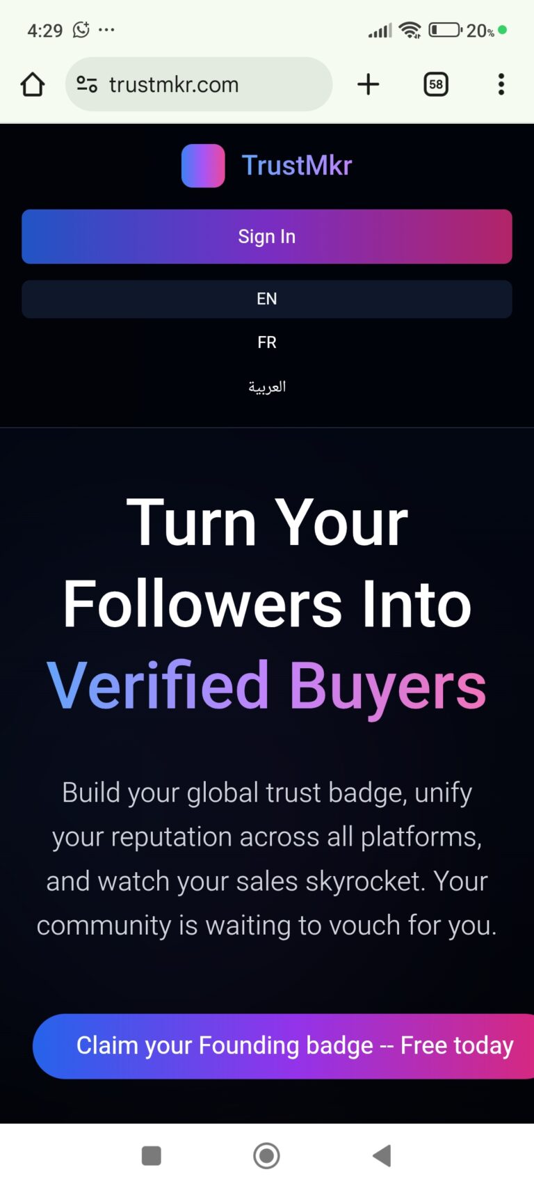
Innovators like TrustMKR are redefining landing pages by prioritizing transparency and community engagement.
- Interactive Social Proof: Go beyond static testimonials—let users contribute reviews and success stories.
- Collaborative Content: Users help shape the narrative, increasing credibility and connection.
- Transparent Metrics: Real-time stats and feedback foster trust.
TrustMKR transforms landing pages from static sales tools into dynamic, community-powered platforms, building loyalty and credibility through authentic user involvement.
Why This Matters
- Builds long-term trust with your audience
- Encourages user-generated content
- Adapts to evolving user expectations for authenticity
Frequently Asked Questions (FAQ)
Q: What’s the most important element of a landing page?
A: The hero section—if you don’t grab attention and communicate value instantly, users won’t scroll further.
Q: How can I quickly improve my current landing page?
A:
- Add clear, results-focused headlines
- Highlight social proof
- Make your CTA obvious and actionable
Q: What’s a common mistake to avoid?
A: Focusing on features instead of benefits. Make sure users understand what’s in it for them.
Conclusion: Key Takeaways for Your Next Landing Page
A perfect landing page combines clarity, trust, and action. Start with a compelling hero section, back up your claims with social proof and benefits, and guide users with strong CTAs. Embrace new trends like community-driven design to stand out and foster genuine relationships.
Ready to create your own high-converting landing page? Download a Figma template, apply these steps, and watch your conversions grow. For more actionable web design tips, check out our other articles and resources at Flux Academy.
Take Action:
- Audit your current landing page using the checklist above
- Explore tools like TrustMKR for next-level social proof
- Subscribe for more web design best practices!


